Rotten Tomatoes Mobile Redesign
A mobile-first product rethink to improve clarity, trust, and discovery.
Client
Hypothetical Case Study
My role
UX & Product Designer
Background
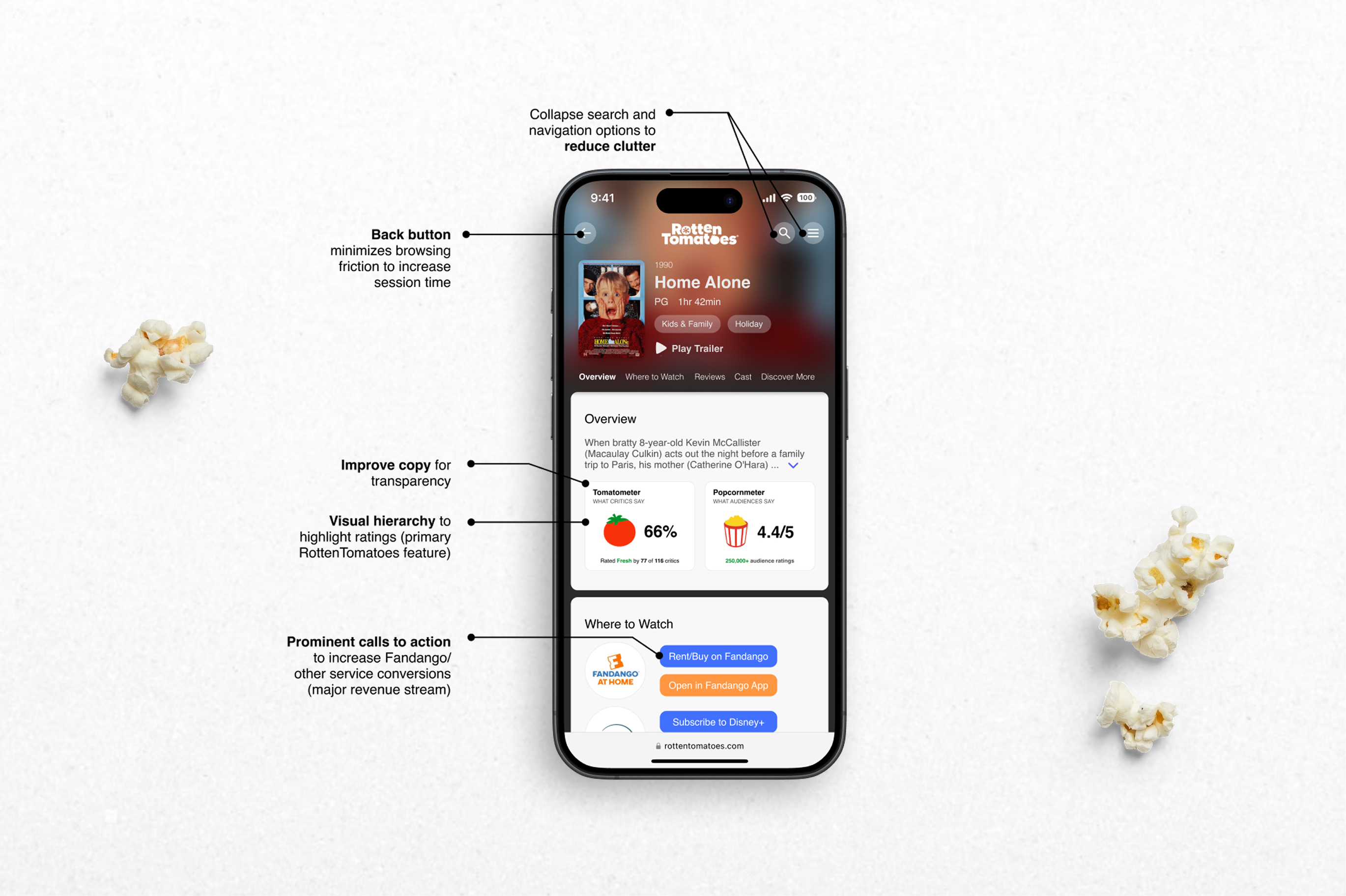
I redesigned Rotten Tomatoes’ mobile experience to make it more intuitive and trustworthy. The new design streamlines layout, clarifies how ratings work, and encourages discovery—all while maintaining monetization via ad placements and service partnerships.
Goals
- Improve layout and reduce clutter
- Make the scoring system more intuitive
- Encourage organic discovery of new movies
Research
I conducted interviews with frequent moviegoers who use Rotten Tomatoes in-the-moment, often while streaming or deciding what to watch. Common pain points emerged:
- Critic scores are misleading due to how they’re calculated
- The mobile UI is cluttered and ad-heavy
- Discovery is difficult—users prefer Google for reviews
Design Strategy
I set out to build trust and usability through layout refinement and clearer communication:
- Layout: Reduced visual noise by simplifying top nav and placing content in distinct containers
- Scoring: Clarified both critic and audience scores with improved language and star ratings
- Discovery: Added intuitive filters and a new “Explore” section to surface recommendations
Design Details
Key interaction improvements included:
- “Where to Watch” buttons made more obvious with color-coded actions
- Critic vs audience scores shown side-by-side with bar visualization
- User reviews and “Write a Review” buttons moved into better context
- Cleaner cast layout and filterable roles (cast vs crew)
- “Discover More” surfaces related content based on genre, mood, actors, and more